Saturday, May 22, 2010

Thematic Variation: Graphic House I


The deets on the Graphic Houses: 
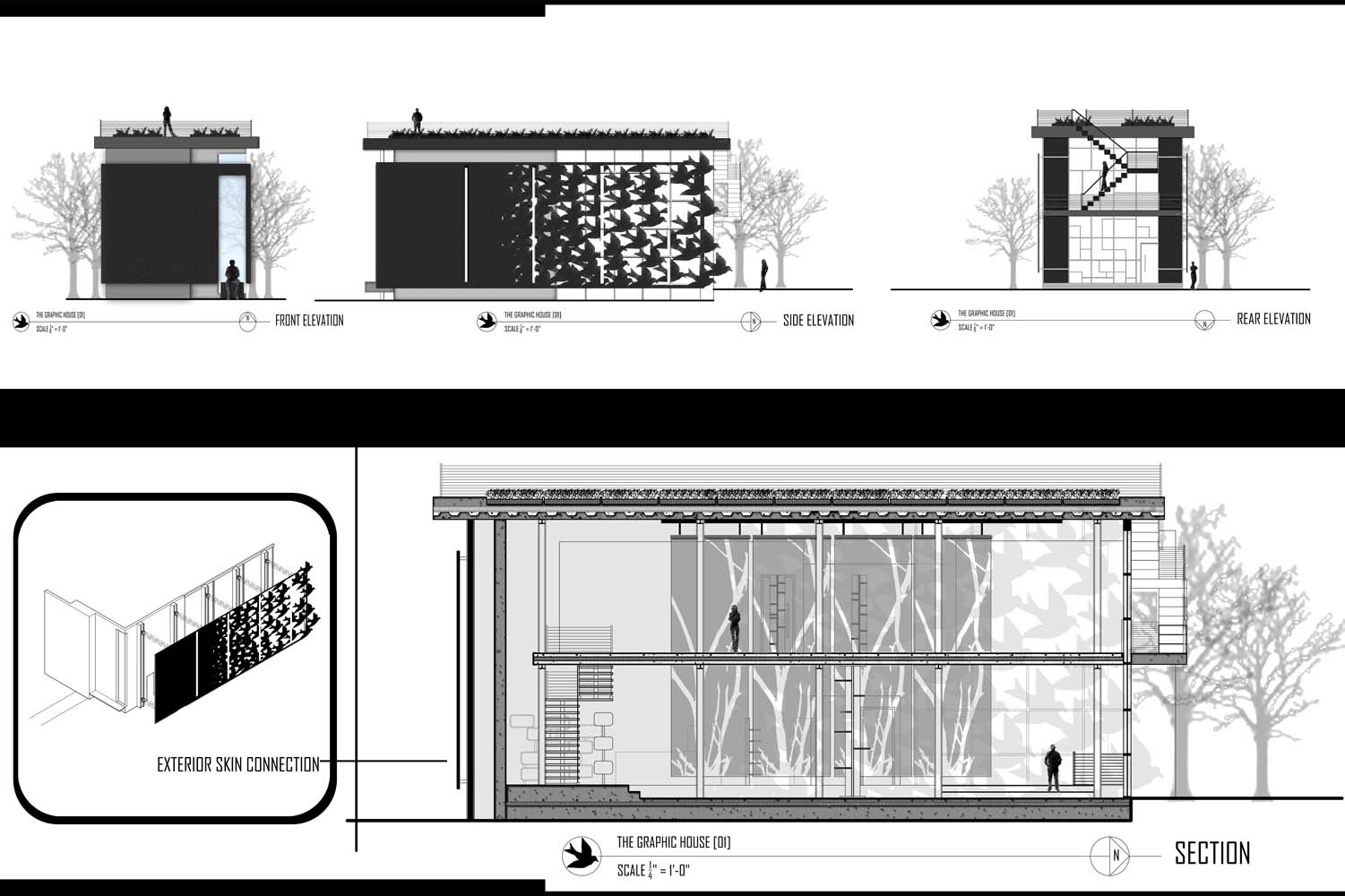
The presented problem these past few months in studio included three very different sites and the need for three residential end conditions. The three sites consisted of one 'Urban', one 'Suburban', and one 'Rural"--all three presented uniquely different conditions and problems, requiring some deep thought in regard to site planning, orientation, and manipulation.  The first house, and the one shown here, was developed on the Urban site. The location of this site is just perfect--a really fantastic little lot right in the middle of an ecclectic, cultural neighborhood.  The site isn't right in the heart of downtown, but rather snuggles into a tight little spot just on the outskirts of the city's definitive edges. Of all three sites, I found this one to be the most inspiring.  Maybe this is because of my untouchable love and bias toward city dwelling, or maybe it's because the site had a lot to offer.  Although constrained in size and tightly surrounded by other structures, the atmosphere of the area is festive and colorful--the neighborhood, seemingly, isn't shy about having fun.

:::Phenomenological and Site Development:::

The graphic for the Graphic House I was developed from a photo taken on the site of a collection of birds resting on a power line. The image was utilized during the preliminary stages of phenomenological site development and diagramming, and was later translated into a graphic skin wrapping around the house's outer structure.


The phenomenological diagramming on the introductory site board above shows a graphic approach to communicating the following phenomenological aspects of the site and goals of site and building development:

-A perceived and physical interaction with the site
-An emphasis on a protected street edge and perceived solidarity as a response to the urban environment
-A breakdown and development of complexity through the structure's progression
-Emphasis on light and shadow play, texture, layering, and exposure


This poor little model below has seen better days...
How would you feel if you were carted around in a brown Whole Foods bag for several months? While the little guy is barely holding together, this view gives a relatively good idea of the explorations I was making with multiple layers of structure, exposure, and the attempts at creating an interesting light manipulation within...


Saturday, April 24, 2010

DirtPunch! @ NORML

DirtPunch! Hemp soaps have officially made their way out of Colorado and all the way over to Connecticut.

The CCSU chapter of NORML in Connecticut graciously hosted my products (as well as other fabulous creations and brands) at their 4/20 festival to promote the benefits and uses of hemp. I was glad to support their cause and am grateful for the exposure. Thanks a lot, guys…and good luck with your work!

In other DirtPunch news, once time frees up around here a bit I’ll be announcing a whole array of new products. As usual I’ve got a plethora of ideas in my head…manifesting them into reality is always an adventure. Stay tuned.


Monday, March 29, 2010

They Dusted Their Paper Wings Across a Concrete Sky

This is my newest piece.  Another mixed media to add to the books.  This one is for the lovely Lilly Temple's birthday. Love you lots, darling.

Saturday, March 27, 2010

Thematic Variation [Graphic Cont.]


The following material is from a recent completion--a study of Thematic Variation through graphic representation.  The project began as a series of three graphic variations based on a primary concept from my Hyb_Arch [01] project from December.  Each composition focused on capturing the essence of several elements of composition and graphic devices--utilizing underlying conceptual ideas from my process work and project development to later create a cohesive presentation of several graphic spreads.


[Image 01] : Final production cover page

[Image 02] : Final Production page one: Fusion of hand sketching, model photography, graphite rendering and text to create preliminary page rich with information and communicative of overall form and context.

[Image 03] : Final production page two: First two of the original graphic variations.  The upper variation utilizes a hand-drawn composite as a base for further exploration.  The variation seeks to explore layering, contrast, and impact--as both graphic devices and within the context of the hybrid design itself. The bottom image, also utilizing the same hand-drawn composite as a catalyst for thematic variation, emphasizes transparency, materiality, and pattern in the context of the hybrid design. 

[Image 04] : Final production page three: Second informative page.  This 'stabilizing' spread offers a grounding combination of model photography and hand sketching to further define the technical and developmental process of the the design.

[Image 05]: Final production page four: The second half of the original thematic variation.  Once again returning to the hand-drawn composite as a reference, the upper variation explores environmental context: Urban context, Rural context, and an Interstitial space.  The lower variation explores a contextual variation with people, discussing posture and human scale in relation to architectural form, human engagement, and activity in space.